 Crnogorski
 English available languages
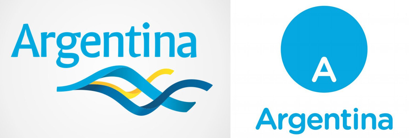
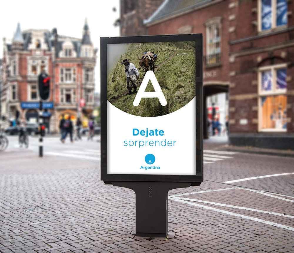
Argentina adopted nation brand new logo. Old wavy logo is replaced by (over)simplified logo which is in fact letter “A” placed in the central bottom of the blue circle (or should be South on the improvised Globe)
Gustavo Koniszczer, Managing Director for Latin America of FutureBrand, defined the new symbol as “a viewer through which everything the country has to share and show, but always with reference to the ‘A’ marking the location of the country in the world”. Consequently, the main use of the symbol will be to contain photography and video.


#Argentina #NationBrandinghttps://t.co/U5CKeYjk3S
— Portal Senat Ⓢ (@SenatME) 10. travnja 2018.
National branding of Argentina is run by its Ministry of Tourism.
According the survey on Under Consideration website, over 75% interviewees considered logo design as bad, design of typeface as bad and its application as bad.
We strongly agree with the public opinion. This logo does not make any connection with Argentina; it does not send any message, association or emotion connected with this South American state. Moreover, blue circle can easily be applied to any other state or company – as seen on the USA Today logo.
CrnogorskiEnglish available languages