 Crnogorski
 English available languages
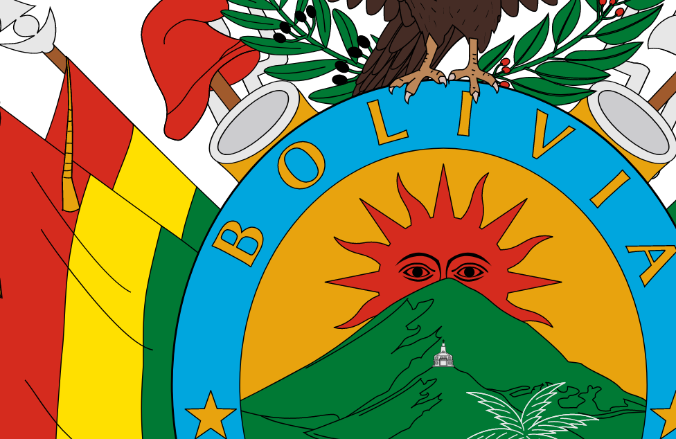
Plurinational state of Bolivia – that’s the long and official name of Bolivia. And it is a true plurinational county.
Lonely planet, one of the most influential World’s travel magazines, describes Bolivia as following:
Rough around the edges, superlative in its natural beauty, rugged, vexing, complex and slightly nerve-racking, Bolivia is one of South America’s most diverse and perplexing nations.
Now here is the question: How to present all of that to the World?
And the answer is:
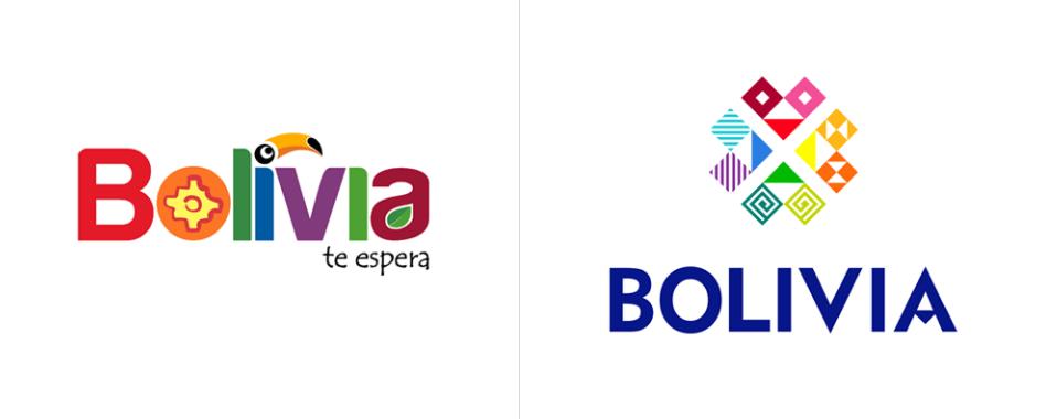
![]()
Bolivian logo of nation brand has moto: the Southern heart. “Cosazon del sur” in fact stands for: the Heart of South America. Bolivian previous slogan was: Bolivia awaits you (Bolivia – te espera).


Marketing Centre Evaluation:
Positive:
- Pleasant-looking
- Accurate color scheme
- Universal shapes
- Beautiful typography (please pay attention to the letter “A”)
- Good at monochromatic impression
Neutral:
- Even the previous logo was very good solution! We found interesting combination of Incan symbols and bird which is typical for the Amazon rainforest. Maybe we can talk now about the new product cycle of logo.
- Triangles and squares are overused shapes nowadays. Are they ideal solution?
Negative:
 Are the words such as Heart/Center overused in marketing purposes? It is unsure if the rest of the world could be able to clearly associate them with Bolivia.
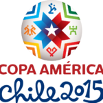
- Logo seems to look like the logo of Copa América football competition held in 2015 in Chile. So, will Bolivian nation brand logo perform well in distinguishing from other South American nations? Also, will it be memorable enough?
- The official website of nation brand is available only in Spanish. Non-Spanish speaking tourists and investors are supposed to be informed about it directly.
CrnogorskiEnglish available languages