 Crnogorski
 English available languages
Lonely Planet’s description of Paraguay is: “Paraguay is a country of remarkable contrasts: it’s rustic and sophisticated; it’s extremely poor and obscenely wealthy; it boasts exotic natural reserves and massive human-made dams; it is a place where horses and carts pull up alongside Mercedes-Benz vehicles, artisans’ workshops abut glitzy shopping centers, and Jesuit ruins in rural villages lie just a few kilometers from sophisticated colonial towns. The steamy subtropical Atlantic Forest of the east is a stark contrast to the dry, spiny wilderness of the Chaco, the location of the isolated Mennonite colonies.”
![]()
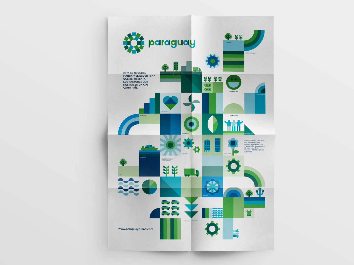
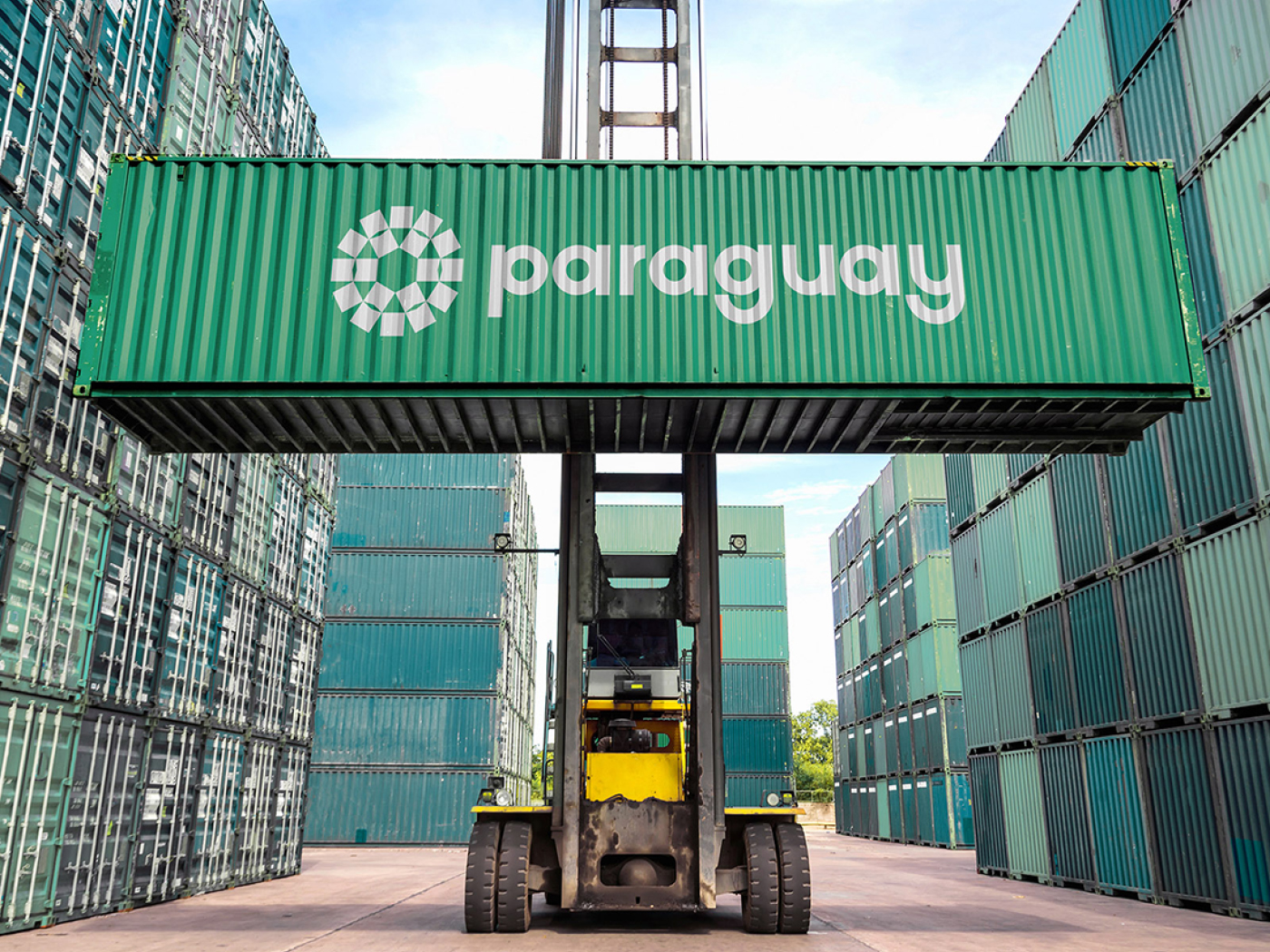
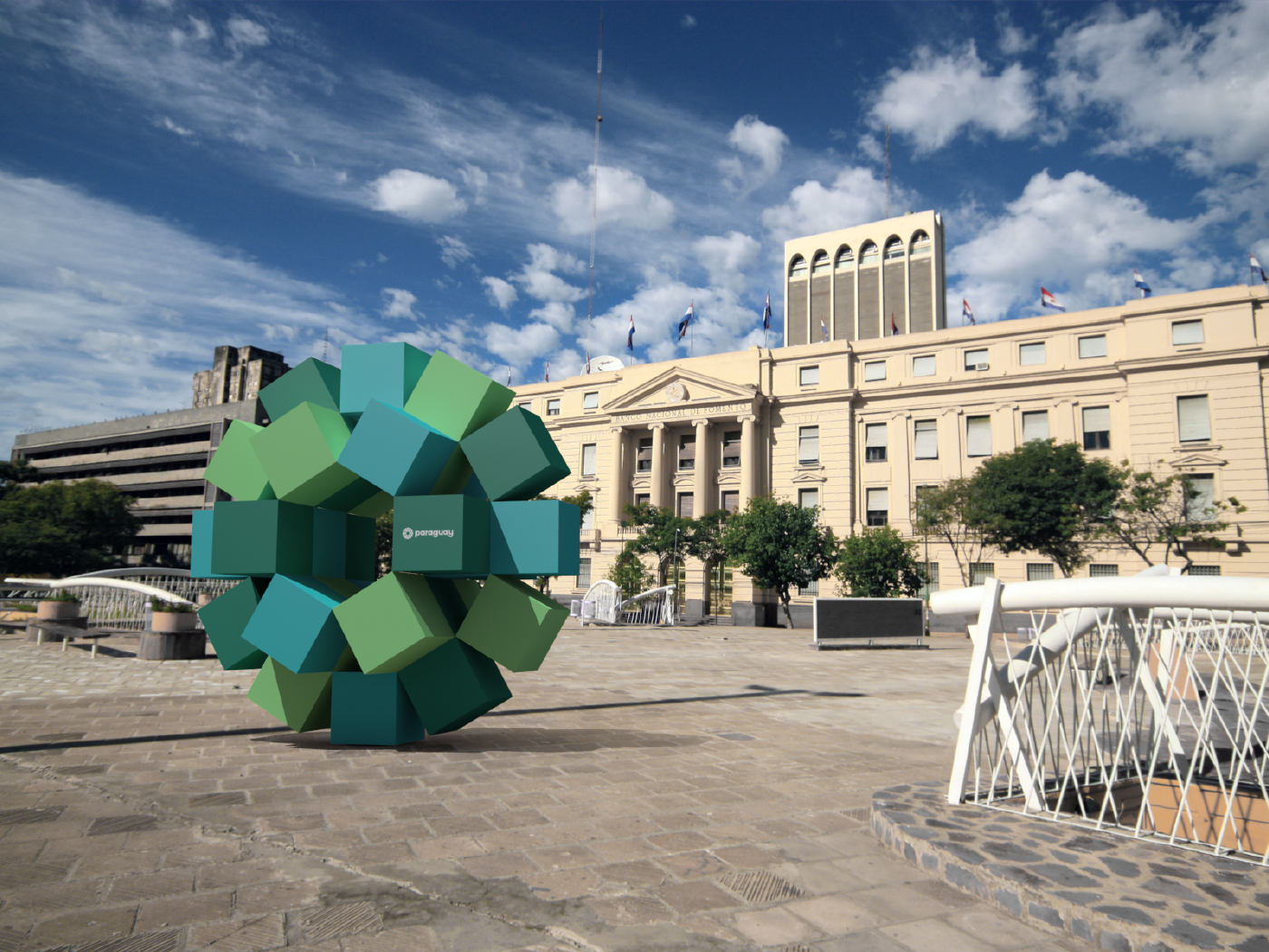
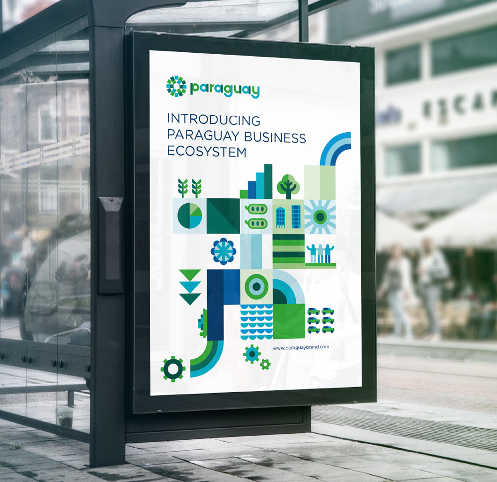
At the end of March 2017, Paraguay introduced its first country brand, designed by Asunción, Paraguay-based Kausa in collaboration with UMA — who appear to be the ones who did the actual design work while Kausa led the overall effort — and Bloom Consulting. The central idea of logo and national brand is:
Paraguay – an economic fertile country
![]()
According to the Paraguayan National Brand website, logo is described as the following:
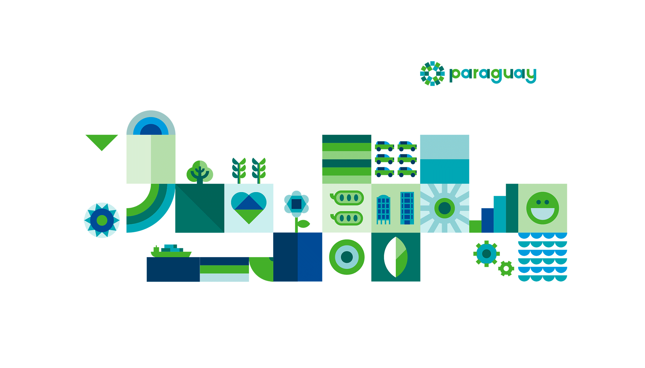
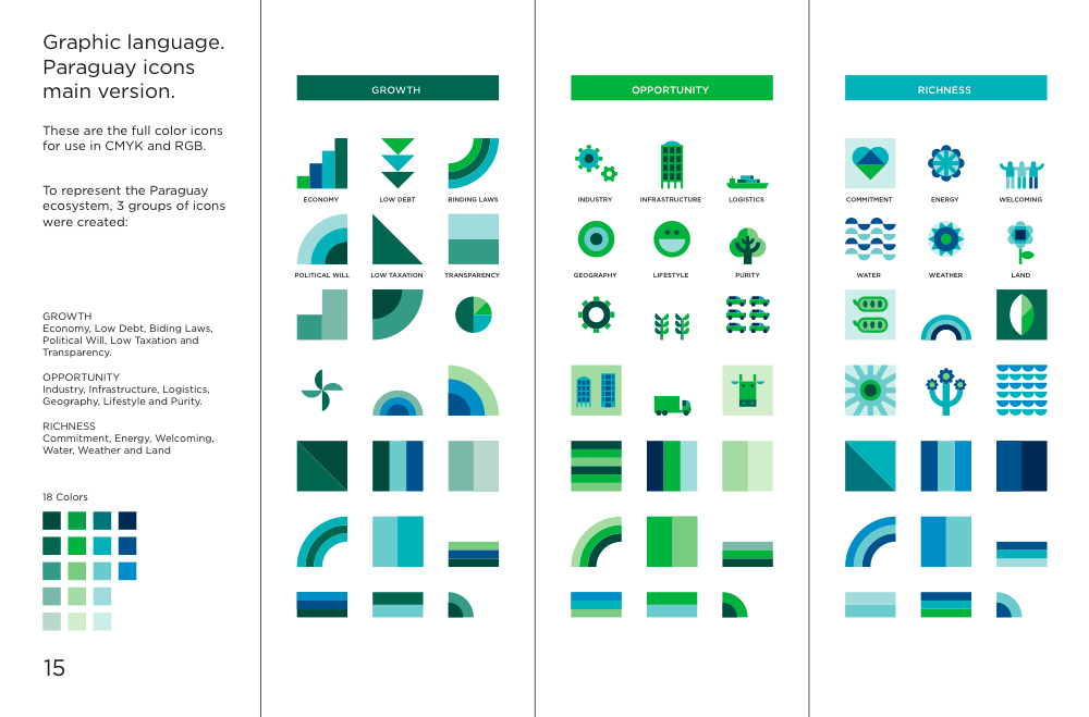
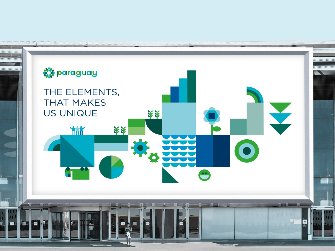
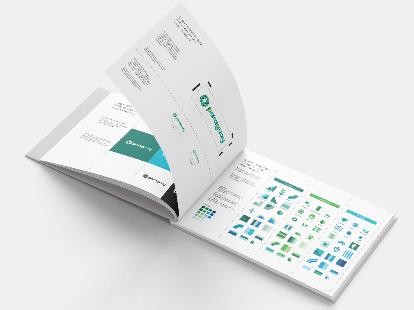
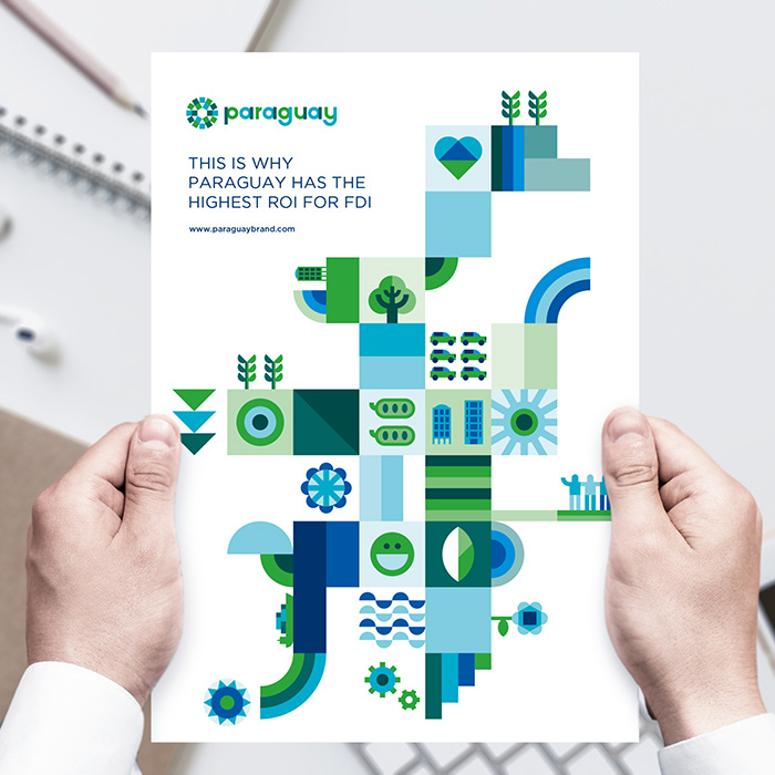
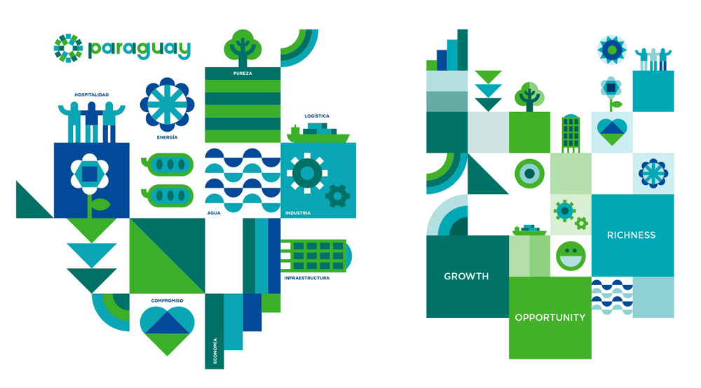
The central idea of the Paraguayan Brand is focused on “an economically fertile country”. The research carried out in the initial phase of the Paraguay Country Brand project revealed that Paraguay is a place where everything grows naturally, from an economic, political, legislative, natural and social point of view. With this in mind, three vectors were defined to develop the country’s economic fertility: “Growth”, “Wealth” and “Opportunity”. Each of these vectors are composed of six different variables that, together, constitute the economic fertility of the country.
![]()
The Paraguay Brand logo reflects the central idea of the brand of “an economically fertile country”. The symbol represents three elements:
- ) Flower – represents growth
- ) Sun – wealth
- ) Gear – opportunities
These three elements create a multidimensional logo that incorporates several characteristics of the country’s fertile economy: the flower represents growth, the sun represents wealth, and gear the opportunities offered by Paraguay. Furthermore,
- Growth is explained with: economy, low debt, binding laws, political will, low taxation, transparency
- Opportunity is explained with: industry, infrastructure, logistics, geography, lifestyle, purity
- Richness (Wealth) is explained with: commitment, energy, welcoming, water, weather and land.


Paraguay National Brand review
Positive:
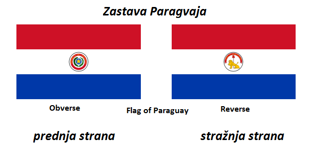
- Color scheme – not using the national flag colors at all. It would be cool if those colors are based on native population national clothes, but it is uncertain.
- Typography is good and recognizable. Font used here is Lyons, we assume.
- Positive, energetic, harmonic
Negative:
- Simplistic following imaginary – too childish attempt of creating nowadays very popular emojis. A green square cow?
- Bad presentation using single color – in monochromatic version squares are divided with bow shape which does not exist in version with 18 colors!
- Images used for the base of logo are far too general. Gears, flowers and the Sun are present in every county on the world, including e.g. Antarctica (see the illustration below). Flower is generic and does not seem to be county-specific. It is unclear how these images can help distinguish Paraguay from other nations
- Website of project, marcaparaguay.com is available in Spanish only.
![]()
Keep in mind that it is also possible to find in Antarctica a cog, a flower, the Sun and – a snowflake. A lot of them.
Sources:
CrnogorskiEnglish available languages